Table Chart Maker
Discover Useful Insights Faster
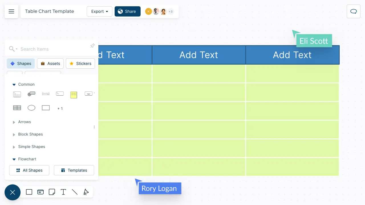
Create visually stunning table charts to organize your information and data. Arrange and merge your data in meaningful ways and interact with them to make effective data-driven decisions.
- Intuitive table shape with advanced customizability
- Import data as CSV and Excel files or spreadsheets
- Real-time visual collaboration to work with teams
Over 10 Million people and 1000s of teams already use Creately
How to make a Table Chart?
Visualize Your Data Effortlessly

-
Powerful and versatile table with precision control and advanced customizability.
-
Format the table with different colors, font styles, & borders to highlight data patterns.
-
50+ types of diagrams with extensive shape & icon libraries to visualize any type of data.
-
Multiple professionally-designed table chart templates for a variety of scenarios.


Organize Data Across Multiple Sources

-
Multiple app integrations with two-way sync to help you import and export data.
-
Migrate data in CSV or Excel files or spreadsheets to visualize on the canvas.
-
Add detailed docs, attachments, links and more with integrated notes.
-
Built-in tools to quickly organize your visuals and create interactive presentations.
Keep Everyone & Everything in Sync

-
Real-time cursors for any number of participants to collaborate on a shared canvas.
-
Comment with context, have discussions and follow-ups on the same canvas. Async!
-
Multiple access & role levels to share, review, and edit your data.
-
Full version history to keep track of key points during each iteration of your data entry.


What is a Table Chart?
When Can Teams Collaboratively Use a Table Chart to Organize & Gather Information?
Here are a few ways a team can use a table chart to collaboratively organize information:
-
Tracking tasks: A team can use a table chart to track tasks and their status. The table can include columns for task name, assigned team member, due date, and status (e.g., not started, in progress, completed). This can help to ensure that everyone is aware of their responsibilities and the status of each task.
-
Comparing data: A table chart can be used to compare data from different sources. For example, a team can create a table with columns for data from different time periods or locations, allowing them to easily compare and analyze the data.
-
Budgeting: A table chart can be used to create and manage a budget. The table can include columns for budget categories, actual and projected expenses, and notes on any budget changes or concerns.
-
Decision-making: A table chart can also be used to facilitate decision-making. The team can create a table with columns for each option being considered, along with relevant criteria and a rating system for each option. This approach can help to ensure that decisions are made based on objective criteria rather than personal opinions.
-
Project management: A table chart can be a powerful tool for project management. The team can create a table with columns for project milestones, assigned team members, due dates, and status. This approach can help to ensure that the project is progressing as planned and that everyone is aware of their responsibilities.
How to Create a Table Chart Collaboratively with Creately?
-
Open a Creately workspace and add your peers as collaborators with edit access allowing them to work on the table chart with you in real-time.
-
Gather the information you need. Open the relevant CSV or Spreadsheet to be imported.
-
Select a table chart template from Creately’s template library or draw one from scratch using Creately’s extensive shape library.
-
Style your table chart using the shape settings and add key data for each element on the table using the data panel as necessary.
-
Share the table chart with reviewers, editors, or viewers or invite them to a real-time video conference, with Creatley’s intergration with Mircrosoft Teams, while making the edits.
-
Find the changes that the collaborators made via the multi-cursors on the canvas in real-time or via the version history. In case you want to revert to a previous iteration, select the version to apply the changes.
-
Gather feedback and discuss with Creately’s in-line commenting.
-
Once finalized, use Google/Microsoft add-ons, embed in an email, website, or export the table chart in various formats including CSV, SVG, PDF, PNG, and many more.
Visualize Data in Minutes with these Premade Table Chart Templates
FAQs About the Table Chart Maker
Tables are usually used to represent large amounts of quantitative or qualitative data in a summarized, easy to understand way. You can use tables when you want to;
- Quickly uncover patterns or trends in data.
- Enable readers to look up specific information that applies to them such as location, age, income, etc.
- Make decisions such as deciding the best interest rate, the best price, or the best job, based on precise numbers.
- Compare data or show ranking in data.
Here are some best practices that you may consider to create better table charts.
- Use a limited number of columns. The lesser the columns are the easier it is to read.
- Instead use more rows to show numbers as it’s easier to skim through data that is presented vertically.
- Use zebra shading or color every second column gray to make it easier to read if your table chart has many columns.
- If your table has a fewer number of rows, use a wide layout, whereas you can use a more compact layout for a table with a lot of rows.
- Use colors to highlight important information in your table.
Streamline Your Workflows by Integrating with the Tools You Love
Creately integrates with the tools your teams use every day and supports your team’s workflow seamlessly.


Why is Creately a Better Table Chart Maker
Creately is the intelligent visual platform enabling visual collaboration, knowledge management and project execution.
100+ proprietary features deliver a flexible, no-code visual platform, expertly-tuned for ease of use.
Infinite Visual Canvas
Visually create and organize any structure you imagine. Drag drop shapes or datasets, embed external content.
Real-Time Collaboration
Work remote or hybrid with realtime cursor tracking, synced previews and proper in-context comments and tasks.
Custom Databases
Create custom databases for any kind of information from tasks, HR personnel records to matters for law firms.
Data Driven Docs
Create docs and notes to go deeper from the high-level visual views. 2 way link to other docs, shapes or data with @mentions.
Professional Diagramming
50+ types of standard diagrams with 1000+ specially designed shapes and connectors enable blazing fast diagramming.
Project & Task Management
Use built-in agile project management tooling or integrate with your favourite project management tool to keep work flowing.
Enterprise Grade Security
ISO 27001, SOC 2 - Type 2, Data Residency & Up-time SLAs to collaborate securely with your entire organization.
Powerful Visual Modelling
Visuals that are backed by databases, update once, reflect in multiple views type of workflows.






Enterprise-Grade Security and Compliance

We’re dedicated to keeping your data private, secure and safe. Creately is SOC2-Type 2 and ISO 27001 certified and GDPR compliant. We offer flexible data residency options in USA, EU and Australia to our enterprise customers.
Just Plug and Play

An easy-to-use interface with a minimal learning curve. Simply Sign-In using your work email to automatically add team members to the enterprise plan.
No installation required.

Work Visually with Anyone for a Fixed Monthly Price
- Unlimited Canvases
- Unlimited items per Canvas
- 20 Active Folders
- 5GB storage
- 30 day version history
- Unlimited Imports
- All export formats
- Basic collaboration
- Email Support
- Unlimited workspaces
- 1000 Items per canvas
- 10 active folders
- Basic collaboration
- 100 Imports
- High Res Exports
- 5000 items per canvas
- 50 active folders
- 30 day version history
- Advanced collaboration
- 100 Imports
- Multiple named users
- Unlimited Databases
- 5000 items per Database
- Project Management tools
- HR, Product, IT, Process toolkits
- Advanced collaboration
- Most integrations
- 100 GB storage
- One Account Admin
- Email + Chat support
- SOC2 & ISO27001 Security
- Unlimited items per canvas
- Unlimited folders
- 1 year version history
- Unlimited databases
- 5000 items per DB
- One account admin
- Email + Chat support
- SOC 2 & ISO 27001 Security
- 3 Canvases (60 items max)
- 1 Folder
- Limited storage
- Basic integrations
- Raster image only exports
- Unlimited items per DB
- Unlimited 2-way data sync from integrations
- All integrations
- Sharing controls
- Multiple Account Admins
- Multiple Sub-Teams
- Single Sign On
- Customer success + account management
- SOC2 & ISO27001 Security
- Custom Data Residency
- Unlimited items per DB
- Unlimited 2 way data sync
- All integrations
- Sharing controls
- Multiple Account Admins
- Multiple Sub Teams
- Customer Success Manager
- SOC 2 & ISO 27001 Security
- Custom Data Residency


